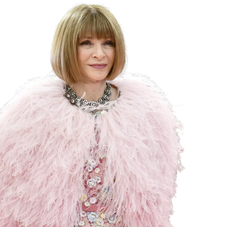
anna wintour at the met gala. she is shockingly without her iconic glasses and wrapped in a fuzzy pink coat that compliments the pink color of the title
Contemporary philosopher Carrie Bradshaw once said, “When I first moved to New York and I was totally broke, sometimes I would buy Vogue instead of dinner. I felt it fed me more.” Indeed, Vogue Magazine has been nourishing and cultivating the discourse on fashion, lifestyle, and beyond since before the beginning of Time. While the magazine has steadfastly retained its cultural relevance, its cover aesthetics have not been immune to transformation—particularly the amount of text on the cover.
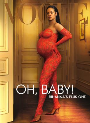
As a child of the 2000s, I am no stranger to the symphony of clickbait text—cover lines in editorial parlance—that used to adorn fashion magazines. But, as of late I’ve been noticing a distinct lack of text on covers. It was Rihanna’s May 2022 cover that really got my goat going. On the surface, it was like many Vogue covers, complete with the signature masthead at the top and an Annie Leibovitz lensed portrait. But the only text on the cover (other than the Vogue masthead) read, “Oh, Baby! Rihanna’s Plus One.”
5 words. 29 characters.
Appalling. Where had all the flashy text in mismatched type, size, weight, and colour gone? I was immediately set in motion to unearth the lost art of textual exuberance.

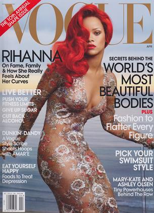
Let's compare Rihanna's May 2022 cover with her first US Vogue cover in April 2011

We'll start by identifying all of the text on the covers excluding the Vogue masthead

Next, we can remove the background image and look at the wireframe for each cover. We can start to see the relative proportions of text to cover

Now, let's consider the total area covered by text compared to the total area of the cover. Around 25% of the 2011 cover was covered by text. In 2022, that percentage dipped to just 6%
The numbers are damning. But is this discrepancy merely an anomaly? Did the bump simply speak for itself? There was simply only one path forward. In this extremely important, time sensitive, and highly requested endeavour, I analysed 22 years of US Vogue covers to ascertain if the amount of text on covers has indeed dwindled. But, before we dive into data on Vogue's recent relationship with text, we must first appreciate Vogue covers' origin story.
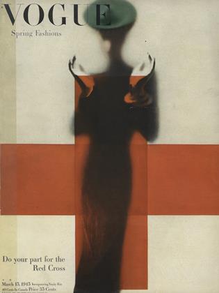
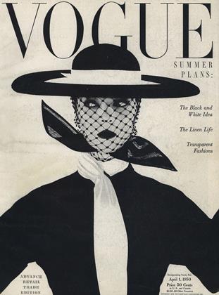
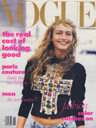
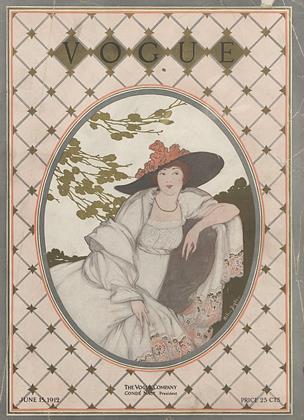
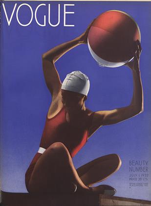
In the early 20th century, Vogue covers featured illustrations. The intention was to create covers so beautiful that one might consider hanging them as a poster. Thus, they were creatively dubbed poster covers. The 1930s saw the transition from illustrated covers to photographed ones, with Vogue debuting its first cover with a photograph in 1932. Despite this shift in medium, the poster-like aesthetic retained its allure. While publications toyed with text placement, the focal point invariably remained the central image (hands up, they were stunning).
Vogue cover
1912 — June
Vogue cover
1932 — July
Vogue cover
1945 — Mar
Vogue cover
1950 — Apr
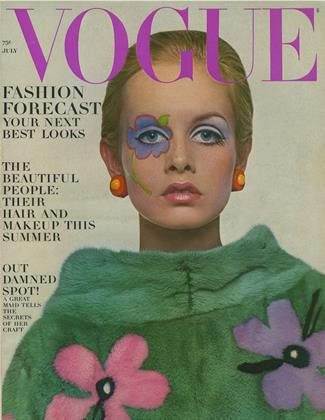
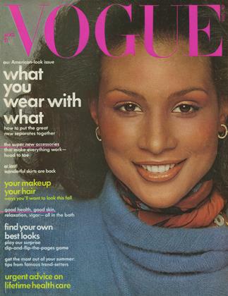
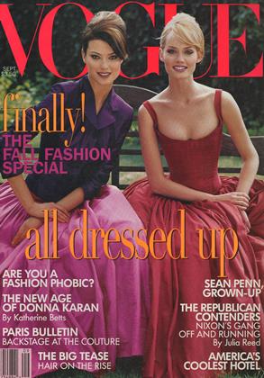
Towards the midpoint of the century, the economic underpinnings of many magazines shifted from subscriptions to newsstand sales. This economic shift manifested on the covers, as they now functioned as an advertisement. Text describing the magazine's contents began infiltrating the margins of magazines, and increased competition led to larger and grabbier cover lines.
This trend was no doubt complemented by the innovative typography, by designers such as Herb Lubalin (<3), and advances in graphic design technology, including phototypesetting.
Vogue cover
1967 — July
Vogue cover
1974 — Aug
Vogue cover
1988 — Nov
Vogue cover
1995 — Sept
This trend continued to persist and mature throughout the 20th century and into the 21st. The rapid improvement of graphic design software and technology in the 90s and 2000s fueled graphic design maximalism. In parallel, the icon herself, Anna Wintour, entered the scene, becoming the editor-in-chief of US Vogue in 1988. Aside from inspiring the cinematic tour de force, The Devil Wears Prada, and stealing the bob limelight from Edna Mode, Wintour played an instrumental role in redefining Vogue's cover aesthetics. She advocated for the appearance of more actors, musicians, and political figures on the cover of Vogue instead of just models.
This stategy, perhaps unintentionally, sensationalised the role of the cover star. The role of cover star became one of honor, for it signified a celebration and acknoweledgement of not only a person's contribution to fashion but to larger culture. Furthermore, this approach positioned the magazine as a cultural lodestar offering access to eminent celebrities. In an era predating the ubiquity of social media, magazine profiles served as a conduit between celebrities and society.
This brings us up to the 2000s, where the effects of the tech boom and Anna Wintour truly precipitate. Let's get into the data!

Here are all US Vogue magazines from 2000 to 2022. Each column is a year and each row is a month. Each block represents one magazine

Just as with the Rihanna covers, we've plotted a magazine's text coverage in proportion to the magazine's cover area

Let's remove the background and rescale the text coverage rectangles, so we can better analyse text coverage over time

We can start to see a trend! More recent covers seem to have a lower text coverage than older covers

To see trends more clearly, let's just plot the text coverages by year

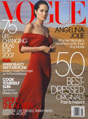
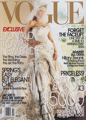
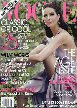
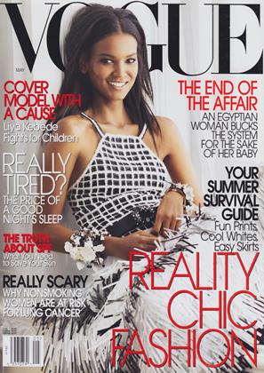
We can see a sort of inverted U shape, with text coverage increasing slightly in the early aughts, peaking in the mid 2000s and then steadily declining

Plotting the average text coverage by year further confirms the trend
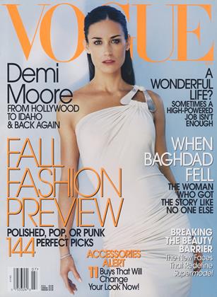
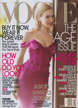
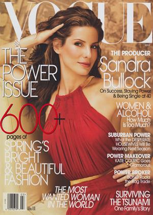
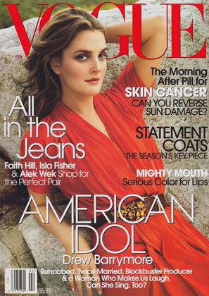
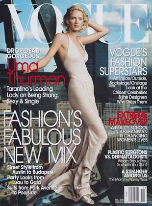
In the early aughts, on the wave of a digital publishing revolution thanks to Adobe software, Vogue covers clung steadfastly to tried and tested traditions of illustration, photography, and celebrity-focused portraiture. Text coverage increased in the first half of the 2000s, likely a product of y2k maximalism, new graphics software, and competition with tabloids.
Vogue launched its flagship website in 1998. Despite, this early affinity to the internet, the web design reflects how the magazine (and much of the rest of the internet) was applying print design thinking to digital mediums. The result was a rather clunky, modular design, slightly averse to positive user experiences. The potential of digital mediums had yet to be realised.
Text coverage peaked around 2005 and 2006, with an average annual text coverage of 35%. Stunning!
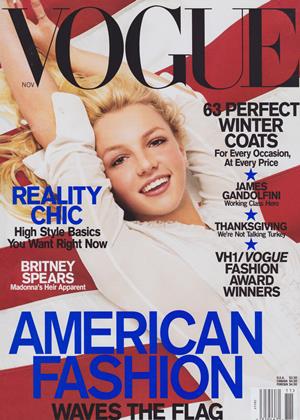
Vogue cover
2001 — Nov
20% text
Vogue cover
2003 — July
46% text
Vogue cover
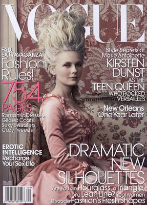
2006 — Sept
35% text
Vogue cover
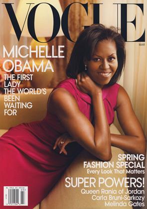
2009 — Mar
19% text
In 2010, Instagram was launched and quickly found success, with one million registered users in two months, 10 million in a year, and 1 billion by June 2018. Digitisation and social media dramatically affected how people interacted with print publications. People's initial encounters with magazines transpired online, rather than in physical stores. While magazine sales remained the primary source of revenue, social media platforms replaced the newsstand as the marketplace.
The online boom also affected people's relationship with celebrity culture. Through social media platforms, celebrities could communicate directly with fans and wield more control over narratives. Vogue was simply a middleman and no longer held a monopoly on celebrity culture.
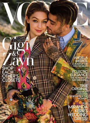
In the 2010s, we start to see the affects of these changes manifesting on the cover, through a gradual decline in text coverage. Put simply, the coverlines were simply caught in the crossfire of the tech explosion
Vogue cover
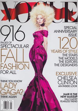
2012 — Sept
33% text
Vogue cover
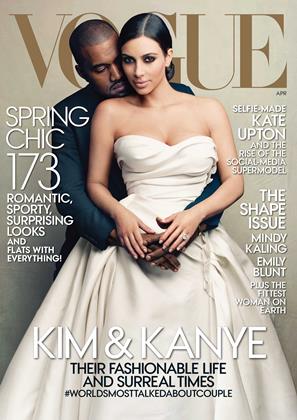
2014 — Apr
25% text
Vogue cover
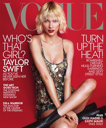
2016 — May
21% text
Vogue cover
2017 — Aug
19% text
The clickbait titles and noisy, maximalist design didn’t translate well to small screens. Graphic design as a whole trended toward minimalism, offering visual efficacy both on billboards and mobile displays and imbuing a sense of modernity.
In place of punchy coverlines to entice readers, magazines needed to leverage a digital approach to engender cultural resonance. The prominence of a cover star proved to have far greater potential for virality than coverlines. Thus, we see more focus on the cover photography and the subject themself. To differentiate themselves from the ocean of celebrity photos and content, Vogue needed to put forth high-impact visuals for shock value. Accompanied by a juicy interview and Vogue's got a winner. Kim Kardashian's and Kayne West's controversial cover in 2014, for example, engendered a boost in Google search interest in Vogue magazine covers.
Google Search Interest in 'vogue magazine cover'
Note: Vogue Cover designs are often revealed online the month before the issue is released. Therefore, interest in a certain month's issue might occur in the previous month. Source
Between 2006 and 2016, average annual text coverage decreased by 15%.
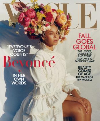
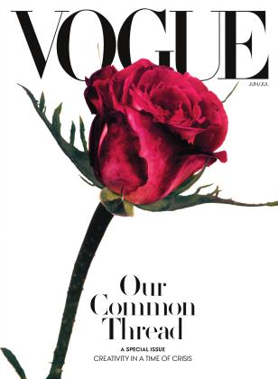
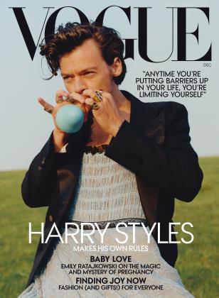
Since 2018, there has been a consistent yearly dip in text coverage, marking an intensified progression of the pattern seen in the early 2010s. A trend that was perhaps accelerated in reaction to COVID-19 and the Black Lives Matter movement beginning in 2020. Amidst the profound suffering, isolation, and reflection frivolous cover lines would've been out of place.
By 2022, average text coverage dwindled to just 10%, 25% less than the peak in the mid 2000s and 10% less than the average in 2016.
Vogue cover
2018 — Sept
15% text
Vogue cover
2020 — June
7% text
Vogue cover
2020 — Dec
13% text
Vogue cover
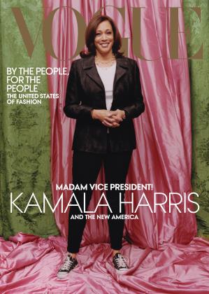
2021 — Feb
12% text
We almost see a rebirth of the simpler poster covers of the early 1900s, with much more focus on the cover imagery and the cover star themself. The dissemination of visuals, as well as accompanying media such as YouTube videos, across social media serves as an advertising medium thus rendering the cover lines somewhat obsolete and unnecessary noise. The high-production editorial shoots provoke greater visual impact and efficacy on large screens, mobile devices, and print while also instilling a sense of modernity and artistry.
Vogue's text journey is undoubtedly a reaction to societal change and a (successful) bid to stay relevant. The cultural imprint of Vogue magazine is profound, yet it, too, has been shaped by the shifting tides of time.
Explore the magazines
Sort by:
Sort Arrow
Vogue cover
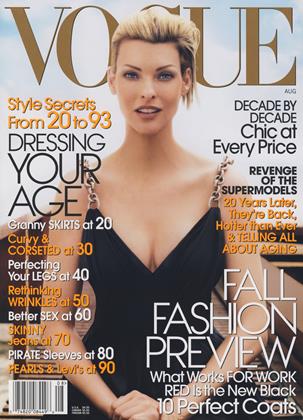
2003 — July
46% text
Vogue cover
2006 — Aug
44% text
Vogue cover
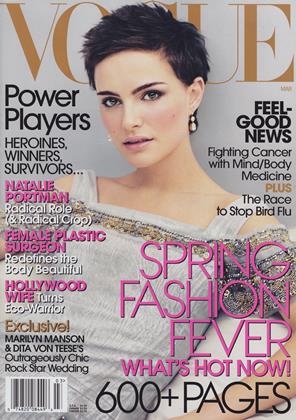
2006 — Mar
43% text
Vogue cover
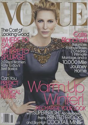
2006 — Nov
42% text
Vogue cover
2003 — Aug
41% text
Vogue cover
2005 — Mar
41% text
Vogue cover
2006 — Feb
40% text
Vogue cover
2003 — Nov
40% text
Vogue cover
2007 — Jan
40% text
Vogue cover
2005 — Feb
40% text
Vogue cover
2009 — Aug
40% text
Vogue cover
2005 — May
38% text